Hello All!
Its been a while!! This attempt of frequent blogging, is harder than I thought, especially if one is not in a habit of keeping one. Do not mistake absence of a new post as a sign of my procrastination, its rather an attempt to find some time off work. With that intro, lets begin the ‘ram katha‘ (tale) of this next project:
Before I start rambling, the post is named Route.ai because I worked on it and stared at it for so long , that I began to refer to the project as rote.ai. ‘ai’ is nothing but a suffix for an Adobe Illustrator file. So lets continue:
Its been 2 years since I started work. My first workplace was in Bangalore, India and the current is in Gurgaon, India. The task I took upon myself was to see, which city made me waste more time travelling (never a good way to lose hours in the day). I have spent 5 years in Bangalore and well Gurgaon is home so such a comparison could be biased. Many a times, a debate with my friends regarding which of the two cities is better and why was a non conclusive one (everyone defends their city after all). The truth of the matter is both have their pros and cons and to be honest are not the best places to live in India.
To avoid answering this question driven by emotions, I decided to chalk out my daily travel to my workplace in both these cities based on PURE FACTS and DATA.
#1
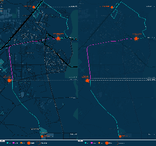
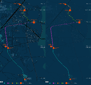
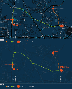
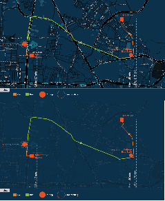
The first method was to use Google maps and map the route and the modes of transport used in my travel daily in both the cities. I spent one week on flash trying to make these interactive, so that on mouse hover the user could see the locations clearly but to my dismay this free version of WordPress doesn’t allow embedding .swf files in my posts. ALAS! The alternate and in my opinion best option was to make .gifs. The images on the left show travel from home to office and the one on the right shows vice versa. So, click the images below, to see the map clearer.
Gurgaon


Bangalore


I realized that using a map with a monotone color and minimalist details really helps in communicating routes. You don’t want to add to the already existing chaos or details of the map with use of colourful lines and text. At this point of time, I would like to mention Edward Tufte, he mentions in one of his books the importance of removing redundant information (unnecessary lines, dots, text) from your work. The maps used here are taken from the library at colourmade.com. You can also create your own customized Google maps in different styles.
#2
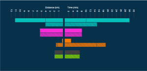
While the first option was in context, the next method breaks up the usage of different modes of transport during the journey. It helps to compare the same modes of transport in both cities. It wouldn’t be right to conclude that Bangalore had more traffic, if I traveled by bus in Bangalore and metro in Gurgaon. Waiting time is not included here though, so the communication shouldn’t be confused with that of the maps above. The solid bars represent onwards journey and the dashed bars represent backward journey.
 Gurgaon
 Bangalore
#3
This one is nothing but a cumulative of the bar graph above. It summarizes the modes of transport to give an idea of the total time taken for onward and backward travel Gurgaon
 Bangalore
#4
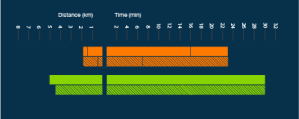
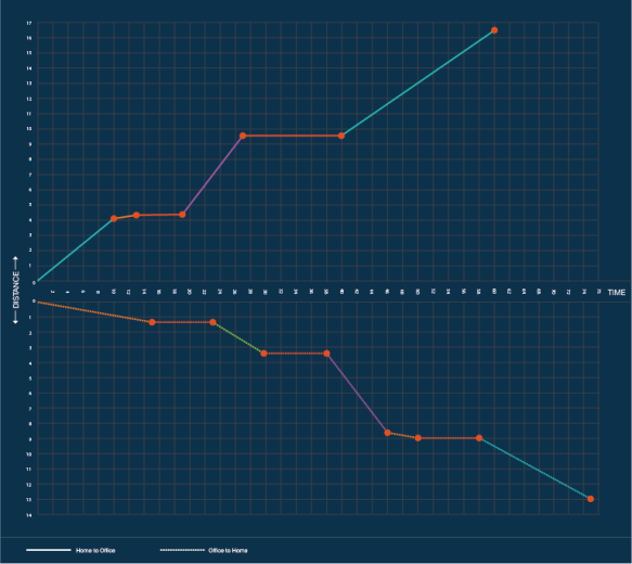
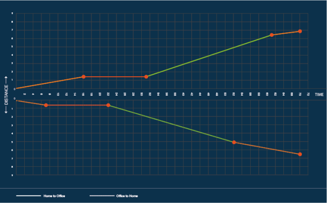
The next method puts distance on the X-axis and time on the Y-axis. The pitstops are plotted on this graph. The additional information is that the slope of such a graph gives us the speed of the travel. So, at this level you can make a suggested guess about how fast each mode of transport is and thereby conclude the situation of traffic in the two cities. The point on the graph where time moves forward but distance doesn’t, signifies waiting time.
Gurgaon

Bangalore

I spent many days trying to come up with new (non cliche’) ways to communicate this information, but in the end this method gave the best information in the least confusing way. I guess sometimes Cliche’ is for a reason.
CONCLUSION
DELHI metro project is one of the best things that happened to the Capital/ NCR and at this stage I could probably say with confidence, its one of the best modes to commute intracity in the whole country.
Even though the distance in Bangalore was half the distance I travel in Gurgaon, time taken was almost the same EVERYDAY. This ought to tell you what the traffic situation in Bangalore is like.
Maybe another level of information that could be added was the cost of travel both ways and map that against the distance traveled. Well, the options can be unlimited when you want to visualise, just depends on the story you want the data to tell.
Well back to a new project, lets see how long that one takes to feature here.
TOOLS
Adobe Illustrator, MS Excel, Kuler,
Stamen design (they have a great bank of stylized maps)
Cloudmade.com ( for the blue maps i used)
ColorOracle (helps you view your artwork as a colorblind person would)

