A little background!
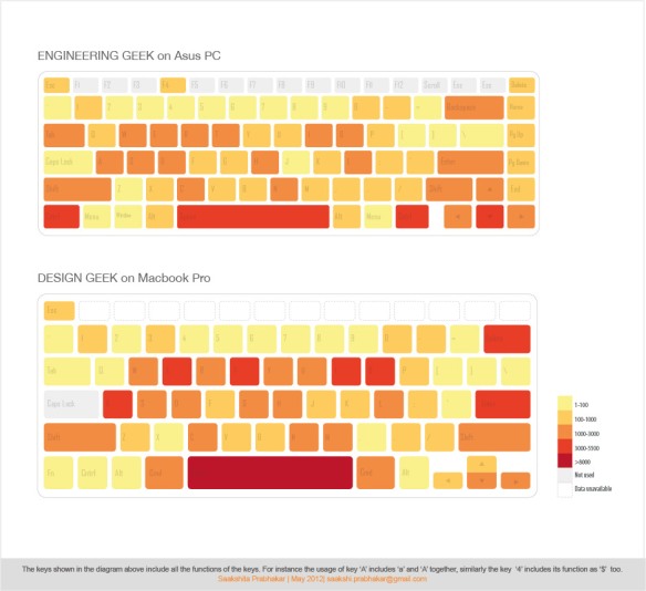
I was sitting and typing out ideas for possible data visualization, when a thought struck me. What if I could find a way to record the frequency of keys I used on my keyboard? Then a friend aka ‘engineer geek’ came to my rescue. We both installed key-loggers on our respective laptops and ran them for a week starting 2nd of May. After one week we collected our respective dataset and thereon my work began 🙂
Just a thought: For me ‘Data’ is synonymous to clay and ‘Visualization’ to sculpture. We can chose what story we want to convey through our visualizations. The results of my first experiment are as follows:

Personal Note: This is so hard to do manually phew!!! Really felt the need to code. My dormant coding skills need to come to life ASAP

#3
My intention was also to explore scale (something I find very hard to use cleverly).
Story: Story here is slightly different from the former examples. The visuals here look at the combined usage of keys by both users. Between the two of us, the key used the least was just ‘2’ times as compared to the key used the most ‘13571’ times. This massive gap in values, made it hard to play with scale. Initially, I tried a treemap but that didn’t work out too well because the scale difference was too large (go to the scraps section at the end of the post to see a failed attempt 😦 of treemap for engineer geek).
Next, I started thinking of fun ways to depict this story of ‘combined key usage’. With lots of effort, time and frustrated iterations, I decided to stick to the top 35 keys. That would narrow down the gap between the min and max values, hence making the usage of scale more feasible. With many frantic explorations, I did find this way the most communicative:

Trust me its not my first idea. It was my second last!!! While it might be linear and boring, it conveys just what it has to. There is no redundant information involved. Its descending order on the basis of ‘combined usage’ shows through scale. Also, each key shows us the breakup of usage by both individuals. I could disperse the elements if I want to, but that would be at random. You need another variable to define their arrangement. For example time would have helped me lay this elements on a different dimension. Another version to the same story could be something like this:

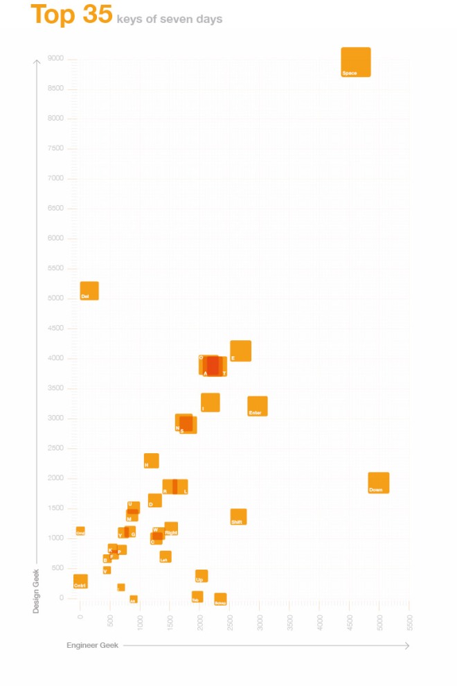
The individual usage is mapped on the two axes to freeze on the position of the element and the size of the element is defined by its overall usage. While in theory it works, I feel it lacks the contrast in size, one would expect to see. The change in scale isn’t very clear to give user an idea of which key was used the most. What it does tell us though, is that of the top 35 keys most of the keys are used within 3000X3000 hits.
NOTE: Things to keep in mind here is that when I refer to a key it includes all the functions that go with it. For eg. ‘A’ includes its function as lowercase ‘a’ as well as an uppercase ‘A’, similarly ‘1’ includes its function as ‘!’ too. Also data for keys like ‘shift’ and ‘cntrl’ is a sum of usage for both the right and left keys
#Scraps
 Treemap for ‘the engineer’ in itself had so much variation in scale, that a combined treemap was nearly impossible to visualize in my art board (should find a way though, as nothing is impossible)
 This was a method I was leaning towards while exploring the third idea. The pink areas were suppose to show my usage and blue were to show his. So in order to calculate ‘engineer geek’ usage you would have to subtract the maximum value from where my usage ends. THIS IS VERY TRICKY!. The problem lies in the fact that while the pink bars have a common baseline, those for blue bars seem to vary. This makes understanding difficult. One cannot compare the usage of keys for ‘engineer geek’ without manually subtracting the values. Also, sometimes the confusion can be that one doesn’t know if the blue starts from Zero or from where the pink bars end. This is the reason why this landed up in SCRAP 😦
I believe in terms of honoring the context from which the data came, the first visualization nails it. I can’t quite decide which is the best communication (each has a different story). But nonetheless those are my views on the subject. You guys share your thoughts 🙂 If you guys have suggestions for what I could visualize next, please send in the data and I shall look forward messing with it. Till next time tata
Inspiration: Fetron reports by Nicholas Felton (huge role to play in facebook timeline I believe), datastories podcast (always saying the best data comes form personal life)
Tools: Microsoft Excel (for data organisation), Adobe Illustrator (for design), Kuler (for colors), ‘the engineer’ (for keylogger data)