Week 4 – so much more

No introduction for this one. It was just OMG. From the get go of the assignment, I made up  my mind that I will finish this one ontime but here I am writing on a Sunday. This is going to be a long post, so I am going to cut through the chase and get started with the assignment

Brief
The Guardian’s Data Blog published a story about unemployment in the US here. Our goal was to get the data and create an think about what kind of interactive graphic we could create with them.

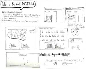
When I was sketching for this assignment, I could totally imagine Hans Rosling giving a presentation on Gapminder about this subject 🙂 You know with the bubbles of 50 states moving between the 2 axes. It has chronology, its has percentage of unemployment, it has population and with more (maybe not) aspects, there could be a perfect gapminder presentation. Since, I know people are familiar with gapminder, I decided to sketch this route in the end (never got to it actually).

In the first and the second route mentioned below, I have visualised only 25 states (for time limitation ofcourse) to explain my idea. Let’s begin

First Route
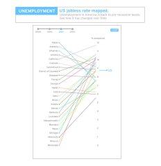
This one is something on the lines of a slope graph. Having said that I dont think it’s exactly like one because of all the slopegraph examples I’ve seen there are variables on the left and right which give the slope some context. If that’s not the case then it’s just a line chart.

For an interactive graphic I imagined something like the following:  
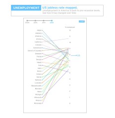
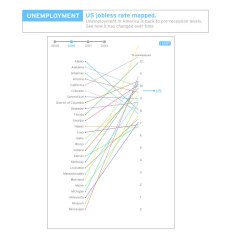
It has a timeline on the top to see the lines change in different years (gif animation at bottom left). It also points out the US average of that year on the right. There is also a sort button which when clicked would arrange the graphics like this:
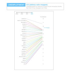
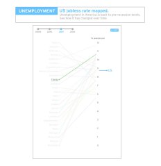
To get a better idea of how one state progressed we can click on the state and it would show like this:
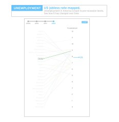
  

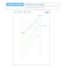
When I reached this state, I remembered something from the course; that was to give feedback for any user action. Which is when I thought that on rollover on the state names a view like this could show up:
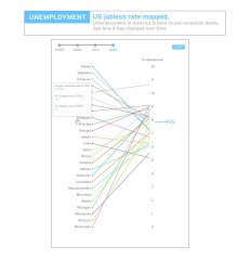
What’s working in this module in my opinion is the overall message. Over the years, you can see where most of the unemployment percentage is changing. A small gif here
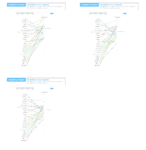
It also works at a summary level and detail level. What I am a little concerned about it that I don’t know how complex it would be to do this for 50 states and the fact that you cannot see monthly progress of the states (which is not mandatory but still!!)

One thing I noticed in this kind of graph is that the variables on the left are not changing it’s position, very unlike the slopegraph example I saw in the post here where the slopes have more context. When I saw this in the examples given by Alberto, I thought changing the positions of 50 states might be disturbing for the eye, so I decided against it (which is why I think it’s not a traditional slope graph)

Second Route
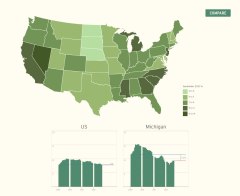
This route visualizes the information using histograms. It’s pretty straight forward actually. At first there is a US chloropeth map which gives us the situation of unemployment in different states as of September 2012.

Below you can see the histogram of US mapped from 2009 to 2012 and an empty square to compare a state you choose by clicking. The state you choose shows percentage of unemployment mapped monthly from 2009 to 2012. Also tells us the % difference from Jan 2009 to Sep 2012.
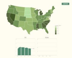
 

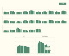
The other thing one can do is to choose compare and see the performance all the states (in this case I only did 25) on the same scale. Then the user can also interact with monthly bar of the state to get some additional information.
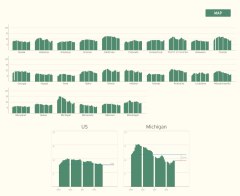
 

One can go back to the map view as and when they wish. The first view gives the states context and summary of the whole situation and the second level gives deeper details.

Third Route
This is more like a thought rather than a finished route. When I was thinking about the data,  I saw some concern about situation becoming worse since Obama became the president. I am not a US citizen and don’t know much of the situation, but have a faint idea. I started wondering if adding an angle of population to this might change something or make some aspects clearer. I  don’t know how true this is, but it is my speculation. Need some facts and figures to prove it maybe.

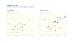
For example if we compare the states of Arizona and Mississippi. the percentage of people unemployed in Arizona is 8.2% which is 245,200 people and that for Mississippi is 9.2% which amounts to 122,700 people. So, as we can see that even though Mississippi has more percentage of people unemployed the actual value is much lesser than that off Arizona; and this is probably because Arizona has a bigger population that Mississipi (my conclusion) correct me if I am wrong though. So, in this option I explored a scatter plot between percentage on Y-axis and population on X-axis for 50 states.
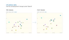
 

I also decided to to a ‘Pre-Obama’ 4 years and ‘Post-Obama’ 4 years because I figured, incase the job opportunities in a state were fixed and the population increased over the few years (plus recession) then maybe Obama presidential rule didn’t do so badly in such a state, as in it didn’t improve but didn’t deteriorate either. Anyhow, must find a better way to communicate this but for now each bubble in this map, on mouse hover could also give some more information about the state in that year
 

Ok so that was it for this assignment. I know I am not expressing it well, but I am still loving this course 🙂 I know il miss it once its over. Now back to my life and its tensing agendas.

Peace
Week 4 – so much more

Week 3 – half way

Week 3 ends tonight and can I tell you this week got serious. Quiet forums, only one reading and no quiz might give us all a feeling that this week was easy breezy, but the truth (for me atleast) is that there was mayhem backstage. We had monster of an assignment and rest assured, it made me think and exercise my mind to crazy limits.

This week we were given a task to conceptualise the design for an interactive graphic based on this. The link was accompanied with this report. 5 days to skim through the report, understand and ponder over and sketch our assignment finally began to daunt me a little. Let me take this opportunity to say that the varying levels in the current representation of graphic done by guardian datablog doesn’t really work (but they have some great work too). Since the levels of ‘country’ and ‘organisaiton’ don’t have a common baseline you cannot tell their actual values.

Being a designer I often chose or have been lucky to work on topics that are interesting and not very data heavy (with the exception of Hollywood challenge in IIB). This assignment challenged the notion of doing convenient visualisations. The reality of dealing with relevant topics and enormous data can be attributed to this week’s assignment. One more thing I learnt was to strategically skim through BIG! reports to get relevant information from it. Now, back to the assignment:

From past weeks and this week I would like to list down a few points that resonate with me, everytime I approach any graphic now.

  1. What does the user want to know?
  2. What shape should the design take? Apt?
  3. Balance between form and function.
  4. If it’s an interactive graphic, does it have a summary layer, an option to filter details and details on demand.

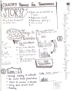
With these points in mind, I began to target the problem. On skimming through the report, I came across a section that spoke about the different levels (namely activity, organisation and country) at which the different indicators work. I read few pages around this section and understood the story behind the data better. To sum it up quickly for you: there are 72 donors and with a new system the donors have 43 indicators at three level (activity, country and organization). Depending on whether the indicator was scored in those levels by our donors, their performance was measured.

Design Elements
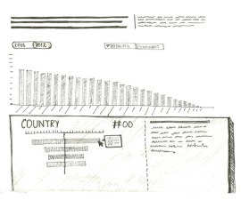
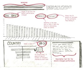
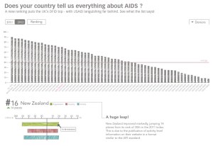
SUMMARY LAYER | On top, a level that gives the summary of the story. The story on a broad level is ‘How transparent are the donors?’. There is an option to toggle between 2011-2012 to see how the percentage of transparency changed since last year. Point to be noted is that while the end result is still in percentage, the method to measure this result has changed since 2011.

RANKING | On clicking this button, it arranges the bars in decreasing order to make the ranks of these donors visible.

DONOR | It drops down a list of continents for the users to select from. Users might be interested in knowing the performance of donors in their country or continent. 72 is a big amount to present in a list and it would be inconvenient to choose from 72 choices, so it makes sense to do a little homework and group them into continents.

BOTTOM SECTION | Clicking any of the bars would initiate the second level of information. At the bottom, each donor is explained in more detail. The break up of the donor’s performance in the three level is seen here. You can also see the current rank and the ‘step up’ or ‘step down’ of the donors’ ranking since last year.

There was a general feeling in the classroom and I also agree that some users might feel the need to know the amount of money spent at these levels. So, presuming that we can find that data, I accommodated that in the left bottom part of graph.

Other Pointers
There are 72 donors for this list, the number is overwhelming and according to my learning from Lecture 2 by William Cleaveland and Robert McGill I decided to make the data set adopt visual shape of bar graphs. They are most intuitive and understandable for variables of this count.

The feedback for the rollover action on the bars at the bottom can give information like ‘the number of indicators scored at each level’.

One question I had was if I should give an option to compare another donor with the one you’ve selected? I am still not fully convinced about it, therefore you can’t see it on the sketch. Too many donors to choose from and why compare only 2? I am still thinking about this one.

While I thought about this assignment for one week, some of you might wonder is this the best way? The truth of the matter is that firstly, this is a course for conceptualising and processing rather than the form. Secondly,(I’m learning it now) it is important to let go the ‘moh’ (greed) of decorating graphics before perfecting its communication (this is not easy)

I don’t know if my submission shows it , but a good amount of brain wrecking went behind this shape. I am in no way saying that its the only option or the best option, but don’t judge the story by the looks of the graphic.

Process

Week 3 – half way

Week 2 with Alberto Cairo

Hello to all of you!

It’s the end of week two at Alberto’s online course and I am loving the idea of taking this online course. Even though I have a full-time job and 100 other things to do and it’s getting harder to follow the course, I find some time to do justice to it. I recommend for people interested in data viz to take this course in Jan. Alberto literally lays out the fundamentals of info graphics and dat visualization through this course. Being a designer, I can say that the course emphasizes more than umpteen number of times on the purpose and need for information design. I’m finding it hard to stay away from the habit of pretty(fying) and beautifying graphics for the sake of its form. A chance to learn the basics I never knew of is a privilege.

Week two’s discussion topic was this:

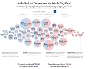
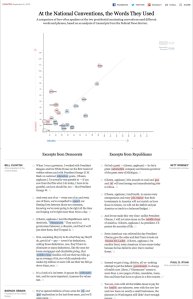
To begin with when I saw this, I thought well this is pretty cool! It conveys almost everything it wants to. Words used the most, Obama using words vs Romney using the same; I dnt see anything wrong with it :O plus The New York times generally do a great deal with their info graphics, so must be perfect. At this point I wish I could tell my professor ‘Alberto, this is a good one, it will flex my brain muscles’.

Then when i knew ‘I was hired by Steve Duenes, infographics director at the Times, to make a constructive critique of that piece’ (hypothetical situation obviously), my mind started to see things it wouldn’t otherwise (ofcourse the readings and lectures during the course help a great deal). So, lets begin with what I came up with:

Things that work:
I like the interesting take on word cloud and the fact that the % of usage of words makes it favour either towards ‘republicans’ or ‘democrats’ (didn’t see this in the beginning though). The second thing I like is the choice of words, Words used are words that make sense in context of politics and debates. If you looked at it overall, you would get a sense of words used by either conventions. Many other positive points and on the whole I feel, the NYT did a good job in making bubble charts clear enough compared to some others out there.

Things that don’t work:
1. The bubbles are clickable but don’t do anything on click. Their function isn’t very clear.
2. When you drag the bubbles out of their place they go where you leave them. WHY?
3. There is a search bar on top to search for words, I didn’t use it much and am wondering if it’s really needed. It’s not a playful graphic and searching for words like ‘is’, ‘and’,’I’ is redundant and has no context
4. Some of the words like ‘AUTO’ and ‘WOMEN’ are described below and I cannot figure out why. Why only these words and not others? Why do they disappear when you drag a bubble out of its place? Initially they almost looked like sections for the graphic.
5. The pull out quotes at the bottom could be a nice element, but is easily missed in the scrolling. Plus its too long and doesn’t add to the story user is getting from the graphic.

The more I look at it and think of it; I realise that it’s a great graphic as a static and the interactive elements don’t have any value addition to the communication. They do things that seem to be deprived of any function. Most of the story that can be communicated is given to the user in the first go.

Improvements
What I can do to improve this communication follows:

I am not very good at coding and the lack of practice in Flash and Indesign hindered my attempt at making this interactive. Im still on it though:

So, the sketches follow:

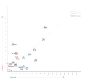
This is how I see the whole thing readjusting itself ( it’s a concept sketch and can be worked on a lot in terms of appearance). What I liked about the previous one was the fact that the words would move towards one convention depending on which convention used it more. I feel the key message for users in this is the correlation of the word between the two conventions. A scatter plot in my opinion communicates 2 things clearly: Firstly, it tells how many times one word is used by both conventions. Secondly, it gives us an idea  of which convention the word is leaning towards. The closer the circles (all same sizes) are to the 45 degree line the more balanced is the use of the word by both conventions.

What could also be a nice element is a zoom button to zoom into the congested areas and blow up the scale :O

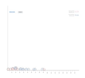
Next step is when a user clicks on lets say OBAMA. This would make the bubbles settle in a state like this one:

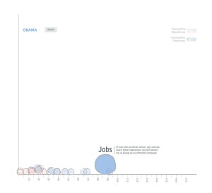
Here all the words drop on the X-axis and show the way the words are used by the democrats. When one hovers on one of the bubbles it would lead to a screen like this one:

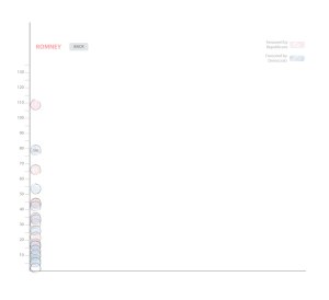
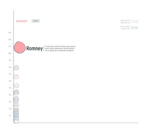
The word that the bubble belongs to shows up here with an added description or caption. One can go back to the full view and do the same steps for ROMNEY and republicans:
 

I know I don’t see much sense in the excerpts but maybe the interactive piece could look something on the lines of this: with much lesser redundant lines and better aesthetics.

Week 2 with Alberto Cairo