Week 6 – Indian women in a fix

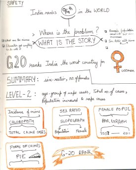
The title of this post says it all. The course might be officially over, but there is so much to grasp and apply, that only practice can embed the learning now. As I wrote in my previous post, my initial struggle in finding a suitable topic really got to me. When nothing came to mind, I sought for inspiration from my surrounding. One day I sat infront of the television listening to the news, when I came across yet another case of a girl whose father was shot for warning the lecherous man who eve-teased his daughter. Then it dawned over me (just like the cliché light bulb over my head) that this could be the topic to visualize. All I had to do now was to pray that I find data specific to this project.

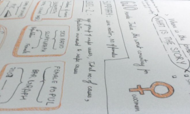
When I started thinking about the topic, I realized that there was a need for a bigger picture and finer details. As seen in my sketch below, there were some aspects of the topics I could consider (thankfully I found decent amount of data for it too). These aspects are listed as following:

  1. G20 country ranking
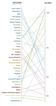
  2. Overall Population of the country
  3. Female population
  4. Crimes that are taken into consideration
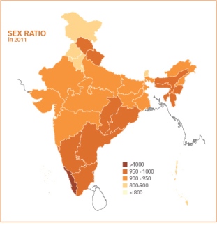
  5. Sex Ratio of States
  6. Incidence of crime across the country
  7. Rape cases reported (since that’s always in the news)
  8. Age-wise distribution of the cases

Of all these little stories, I couldn’t use all of them and therefore the selection process began. Some of the decisions were my conscious choice, while others were as a result of the layout of the infographic. Either ways I realized, that since one of the limitations (or maybe not) of a print graphic is its one glance view and not step-by-step journey (as incase of an interactive piece), I cannot afford to put all the details in this one piece.

Anyways one thing led to another and the final piece looked like this:
WEEK 6 
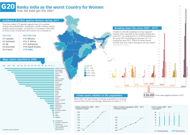
For a clearer, zoomable view please see the link here

Please Note: I couldn’t find data for number of rape cases state-wise reported in 2011. If you can provide me with that data, Il update the infograph ASAP.

The story is basically to throw some light on the topic and show that while the male-female population is growing in sync with each passing year, the cases of crime against women has jumped to quite an extent. I am not sure yet of the reason and cause behind this (politicians and the culprits have their own versions), but the data surely opens our eyes to the status of crime in this country. Doing this project surely made the facts clearer to me. Being a girl in this country, I think it was a good topic to explore, gives more context to the news I hear everyday.

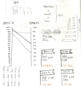
There are some graphs I didn’t manage to accommodate in the final infograph.
leftover1 leftover3

With just 4 days in hand, I did the best I could. I went through a great process and I know that for me the process was a bigger achievement than the final result. Having said that, I know myself that this particular infograph can be improved a lot (especially the colours). The course has motivated me to do many topics in the future and probably after I have slept a little, I will relook at this, like my other exercises on MOOC and improve on it.

Notes
Note1 Note2NOTE-3

Source

Links
http://feministsindia.com/india-ranked-worst-g20-country-for-women/
http://www.tradingeconomics.com/india/population-female-percent-of-total-wb-data.html
http://india60.com/stats/census/2011/

Reports
http://ncrb.nic.in/CD-CII2011/cii-2011/Chapter%205.pdf
http://www.trust.org/documents/womens-rights/resources/G20Poll2012-methodologyandresults.pdf
http://nipccd.nic.in/reports/ehndbk10.pdf
http://cbhidghs.nic.in/writereaddata/linkimages/6%20Demographic%20indicators9490761835.pdf

I guess I will write a separate post about my experience with MOOC but for now I can say that it was a great experience.

Week 6 – Indian women in a fix

Week 5 with no high five

To be honest, this 2 week project has broken my exhaustive flow. Once I got down to sleeping, I slept like crazy and managed to finish the quota of sleep I lost in the past month. By the time, I got down to thinking about the assignment it was thursday.

So, the assignment for week 5 and 6 is bound to be our final project and when I read “This time, I am giving you the freedom to do whatever you want.” on the brief by Alberto Cairo, I thought to myself oh no!. The things is that when I am given choices I cannot get my head to focus on one topic. One thing was clear though I wanted to do a visualisation specific to India. Some of the broad areas of interest were as follow:

  • Carbon or GHG emissions in Indian states over the years
  • Sanitation provisions and concerns across Indian states
  • Water borne diseases in states (hoping to get a story about the cause and conclusion)

Here is the thing. The week finished and I came to a conclusion that our country needs to document our data better. Its a pity that we dnt have a place form where we can take the data and play with it. There are so many reports and so little cohesive raw data 😦 I am saying this in the utmost agitated and frustrated tone possible. I am not suggesting that there is no data out there, but most of the times you have to write to departments or people concerned to get the raw form of data (xls files). I know this from my prior experience with my thesis project. Having said that I will take the opportunity on this post to tell you the places I dug out where you could possibly find some data about India:

The issue with the forums above is that there is no continuos documentation for a particular topic over the span of few years. Most of the topics are a documented over scattered years and it is difficult to gather any story without the criteria of continuous time. Secondly very few topics are distributed state-wise. If I want to study about a topic and its impact on India, I need some level of depth to get any story out of the data. general figures don’t say much. There is one source though that seemed promising

This looked like it had some potential with xls files, but the catch is that I need a membership, will find some time to figure out the deal behind its membership (aaaargh why can’t things be free, it’s the age of open source for god sake).

Anyway, having lost a week and no time to wait for data I decided to go ahead and just finish the assignment with any data I find and then I thought of Facebook. I thought it would be nice to see the growth of facebook and other demographics related to ‘fb’ in Indian states. Might be interesting to have a parallel angle of the number of people educated in these states during that time or the number of people who have access to computers. While I found general country facebook demographics, I couldn’t find any data I could use to tell a story. For general demographics on social media, I found this to be a good source:

The thing is that I wasnt satisfied visualising general facebook demographics. The voice in my head kept on saying ‘Now what, so what’ and my motivation was really low to even start the assignment. This is when I thought today, ok one last time lets give this data hunting a shot. Maybe I won’t get the topics I want, but maybe I can use the most cliche and boring data for India and visualise it with a twist. So, there are some sources that I think might work for my final project and I will share that with you in the next post. My 2 week project is going to reduce to a 3 day project 😦 Must stop blogging and run.

In case any of you have a portal or place in mind where we can dig out xls files of data, please do comment on this post and let me know. I will be grateful 🙂

Week 5 with no high five