Introduction
I know I haven’t posted anything in a while, but data viz is and will always be on my mind. I am currently taking a 6 week course with Albert Cairo on introduction to infographics and data viz. Looking forward to it and its going to be fun 🙂 There are going to be some random images here and some not so random for the purpose of the course. So, please bear with me.
WEEK 1
The first week is almost coming to and end ( well actually it has ended today) and I loved it. The fact that the course became a reason for me to read is an achievement in itself for me. Can i say Albert Cairo is a great teacher. The course is really well-organized, i mean the expanse of the internet might be a hurdle sometimes, but inspite of that, there is enough to keep you brain ticking.
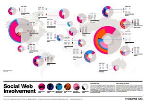
The readings and the video lectures emphasize the same points and therefore the idea or the learning of the week manages to stay put in my tiny pea sized brain. Besides other requirements of the course, one of the major ones was to critique and attempt to redesign the following graphic:

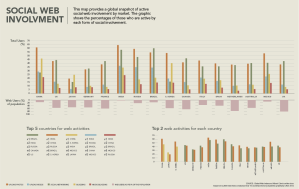
Given the learning and feedback here is a quick revision of the info graphic. Its down and dirty and not to be looked at as a finished piece:

Revised version after getting feedback from my fellow classmates at mooc
This was an experiment I tried with rearranging the social activities in decreasing order of priority. I feel that this makes it difficult for the users to understand the data, as the colours keep changing.

Just scraped by the mandatories in Week 1 and it just gets hectic from here on. Kicked and scared about week 2 🙂

