


._._


Blogging on a hold
Its been a while since I blogged (but that often happens with blogging) and so since I last blogged, Ive been pursuing my masters at UCLA DMA. Its been a roller-coaster ride worthy of a separate blog (which I am not going to make). This blog is going to be a space for me to share out some coding visualisation sketches (like tumblr, except that I don’t want to make one). From now on there is a new form of visualtidbits, till its takes another avatar.
Post Hackathon
Last weekend was an exciting one. I went for my first ever hackathon (don’t get me started on the name) and it was AWESOME. With all my conviction, I can say that the experience was really refreshing 🙂 Lets revisit the weekend together shall we?
Registration
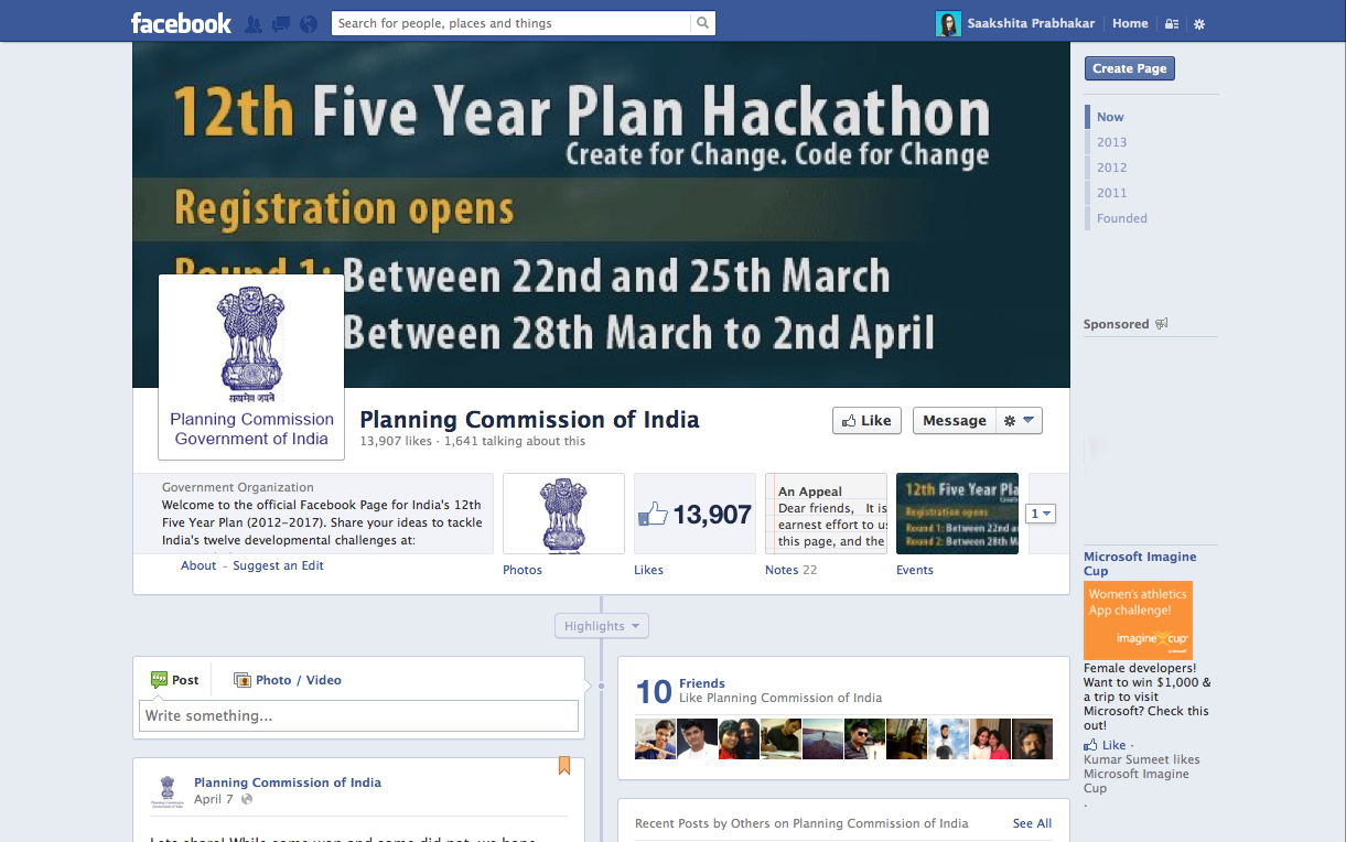
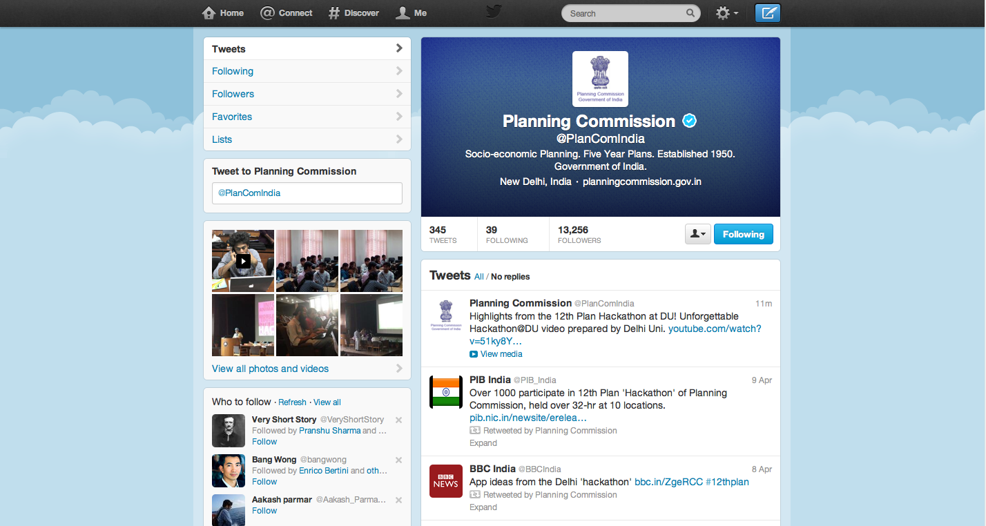
After my last post, I kind of lost interest in the idea of registering for the hackathon until 3rd April when my social media accounts were swarmed with hackathon excitement. Stumbled on the hackathon page to realize that the entries were closing on 4th midnight. Without giving too much credit to my confused, lazy mood, I registered and started reading the instructions. By this time I was totally into it. All the buzz in newspaper, news channels, social media started surfacing. At this point I must admit that (for a govt initiative) I was pleasantly surprised with the website, the instructions, schedule, FAQ’s and other organization skills they showed on their website. The planning commission had twitter account and facebook pages which were surprisingly working and answering your queries all through the night (generally you only see people writing to these initiatives with no response) KUDOS to that! When you are used to associating words like chaos, lost, confused, non user-friendly with government websites and competitions, this one would make anyone smile.
Categories
Briefly there were three categories under which you could participate. There was application, short films and visualisations (they meant infographics mainly). After some thinking (no brainer really), it was pretty clear that the skills I acquire, were good enough to do a visualisation. Although I wouldn’t have minded teaming up with someone to explore some D3 or processing visualizations (which could probably border the app category).
When I registered for this event, I wanted to be a part of this movement which realizes the value of information design in our system especially when it is an initiative by the government or likewise. With a little skepticism about their knowledge of the field of information design and judgement to decide winners, I was sure winning was not the right incentive for attending the hackathon. I wanted to see how sensitized people were to the advantage of visualizations and mostly just wanted to learn and have fun (after all it was my first hackathon)
Teams do come true!
Post registration, I put out a word on social media asking people from different fields to join me in a team . I know most of the times this is a bold step (teaming up with strangers) you don’t want to encourage because it might hamper your way of working, but with all the infographs I keep doing I might as well have given something crazy a shot. I mean what did I have to lose? I was anyways going for fun.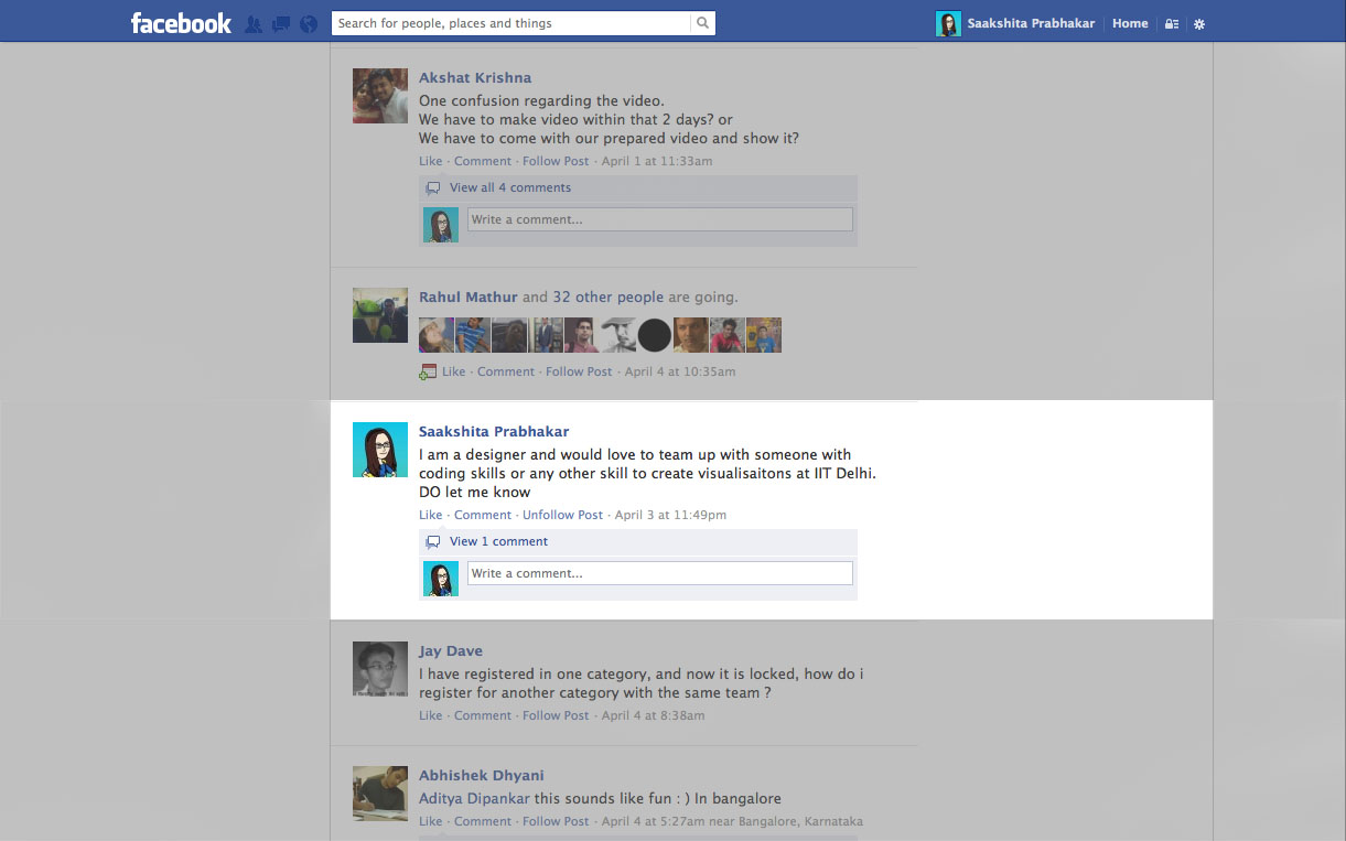
So, over the next day or two I got some response to my post on Facebook. While some didn’t work out because of technicalities, one did 🙂 Few hours before the hackathon on the 6th a person named Denzil Correa (another registered hackathon participant) wrote to me. He is a phd student in Computer Science in IIIT Delhi and dedicates a lot of time doing data mining. We exchanged some words on facebook followed by a quick competition related skype conversation at night. We weren’t really sure if teaming up on spot would be allowed but it all worked out eventually. THANK GOD!!
I got to meet him next day morning at our center (IIT Delhi) post the orientation. It’s amazing how much smoother things turn out to be if you are just open to new experiences. We got to talking about teaming up, internet, hackathon lectures, the campus and soon enough we were quite comfortable with each other. The team chemistry was great and the fact that we were strangers from different fields, it was like my dream come true team. He had done all this homework on the data he wanted to play with and I was open to almost any story in the 12th Five Year Plan so we were off to a good start. It was a great team and I couldn’t have been happier for the team work we did.
Hackathon Hours
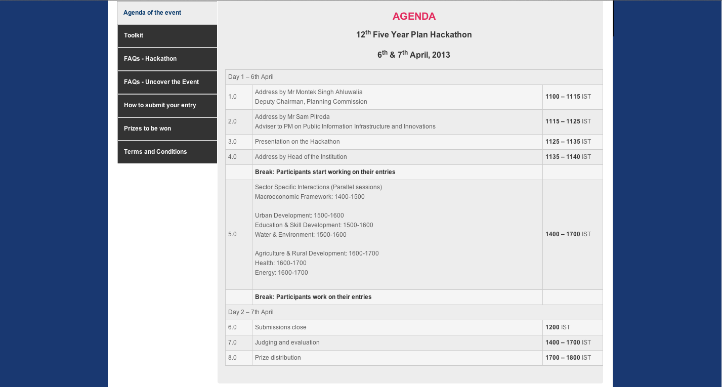
The hackathon was scheduled to be 32 hours. You can check out the agenda below:
What was reassuring was the use of google hangout to bring together the orientation for this hackathon across 10 centers. Maybe I underestimate(d) the tech savy organisation skills but the fact there was an enthusiastic young team that kept this hackathon alive on social media made a lot of sense. For most of the part, the google hangout went well albeit not so good internet condition at my centre. People could have a Q&A session on a national platform. Nothing new in the medium of using hangout, but I have to admit to see it happening for a competition in India made me proud (it’s better late than never).
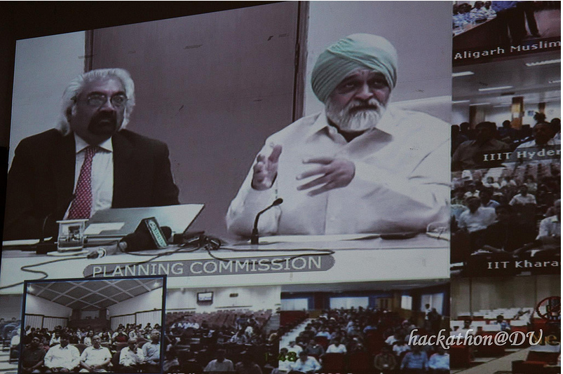
Like any other function in Indian institutes, first few hours of the hackathon had a series of important people talking, flattering and publicity stunts most of which (if not all) was not related to the hackathon. In my opinion that was a very small downside and could be ignored, sometimes you just have to do these things as formalities and it was too small an issue to get upset over or reduce my excitement about the hackathon.
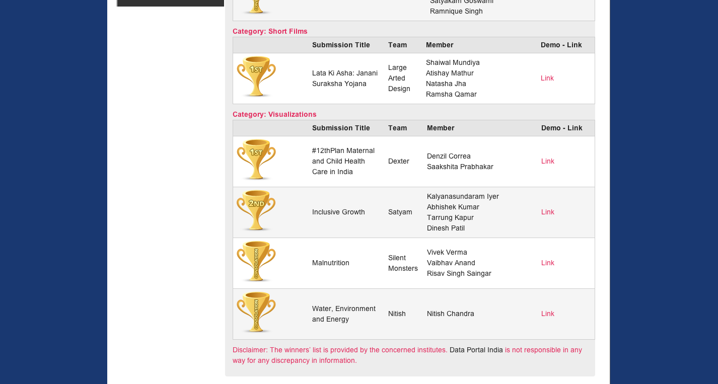
The 12th Five Year Plan was divided into sectors and participants could choose any sector they wanted to work under.
This was pretty overwhelming. The reports were giving an overview and the data was all over the place (like many Indian reports). Data in these reports definately required some cleaning and sorting. At this point I had to agree with Denzil when he said ‘we should focus on one topic otherwise the data is not going to make any sense’. We decided to focus on child mortality under the health sector. Nearing the deadline it became an infographic on maternal and child care. We had strong reasons to convince ourselves why we focussed on a small aspect and maybe at that point it is not what was expected from us, but yet again we were their to do things right and not make a pseudo winning graphic. I mean its one thing to beautify an existing jumbled report and another to create something that makes an aspect more understandable and clearer. We chose the latter
Having discussed the numbers and data Denzil got together till 6 in the evening, we began to design. I made a general flow and discussed it with him. The rest is just how it always goes. Sat together till 7 in the morning and made a submission that looks like this:
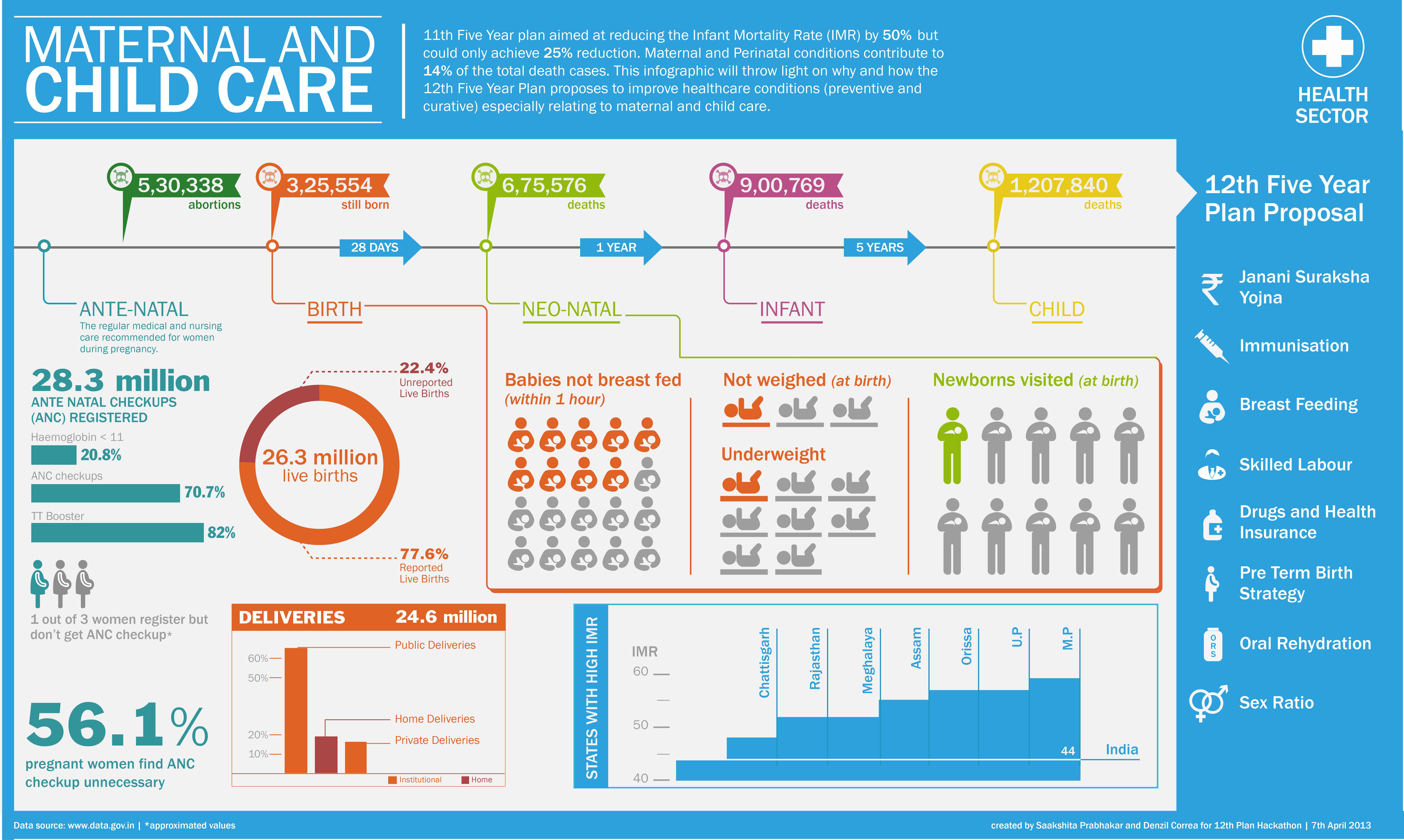
Denzil was great help as a teammate. I heard what he had in mind and tried to do justice to it in this infogrpahic. Sometimes he compromised, sometimes I; we worked like any other team members who know each other would work. After 12 hours of designing in IIT Delhi and seeing the campus sunrise, we decided to head home to get some rest and submit our entry from there (the net was a pain through most of the hackathon).
Got back to IIT Delhi at 2 pm and with everything that could possible go wrong; presentation not working, Denzil not being reachable, slow internet and god knows what not, we got through it and made that presentation to the jury 🙂 I loved it
Reaction
The reaction to the infographic was positive and pleasant. People appreciated the aesthetics and probably welcomed our idea of focussing on a small topic because believe it or not we were awarded the 1st prize in the visualisation category. To get an award, when it’s not your intent is a different feeling altogether (can’t pinpoint what the feeling is exactly). Post the award ceremony, we got to meet the young team behind the social presence of the hackathon and share our point of view with them. Great conversations, great people, great time, great volunteers and an awesome teammate, the hackathon was a moment to remember and definitely a positive result of taking risks. The thing I was happy about the most was the fact that I could take this opportunity to show what good info-graphics could mean and here is hoping that in few years from now we will move beyond just infographics to do great data visualizations for our country 🙂
I probably missed minute details about the hackathon but I can’t make this post any longer 🙂 so if you have anything in particular to talk or ask about, just leave a message.
Memory Lane
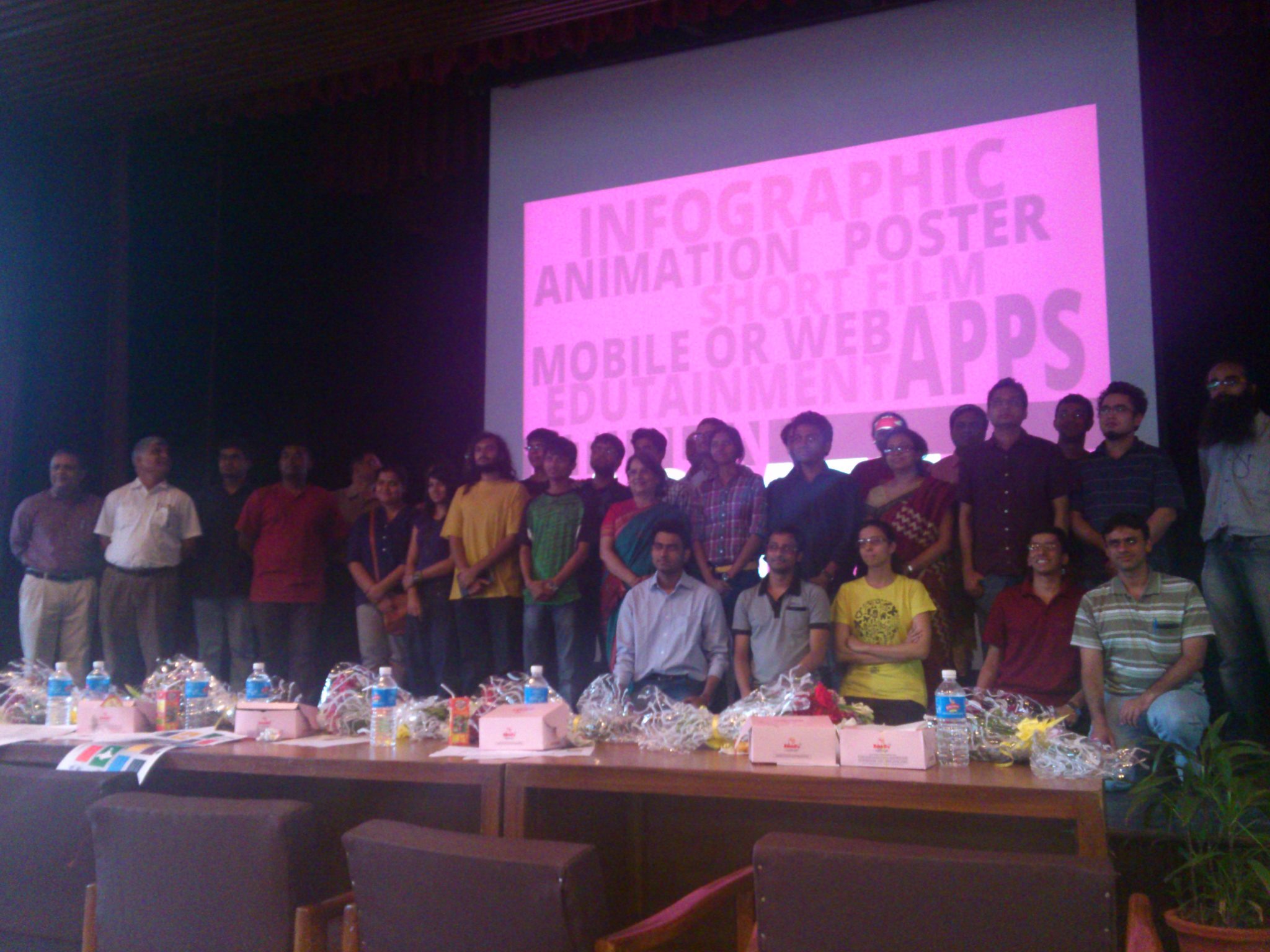
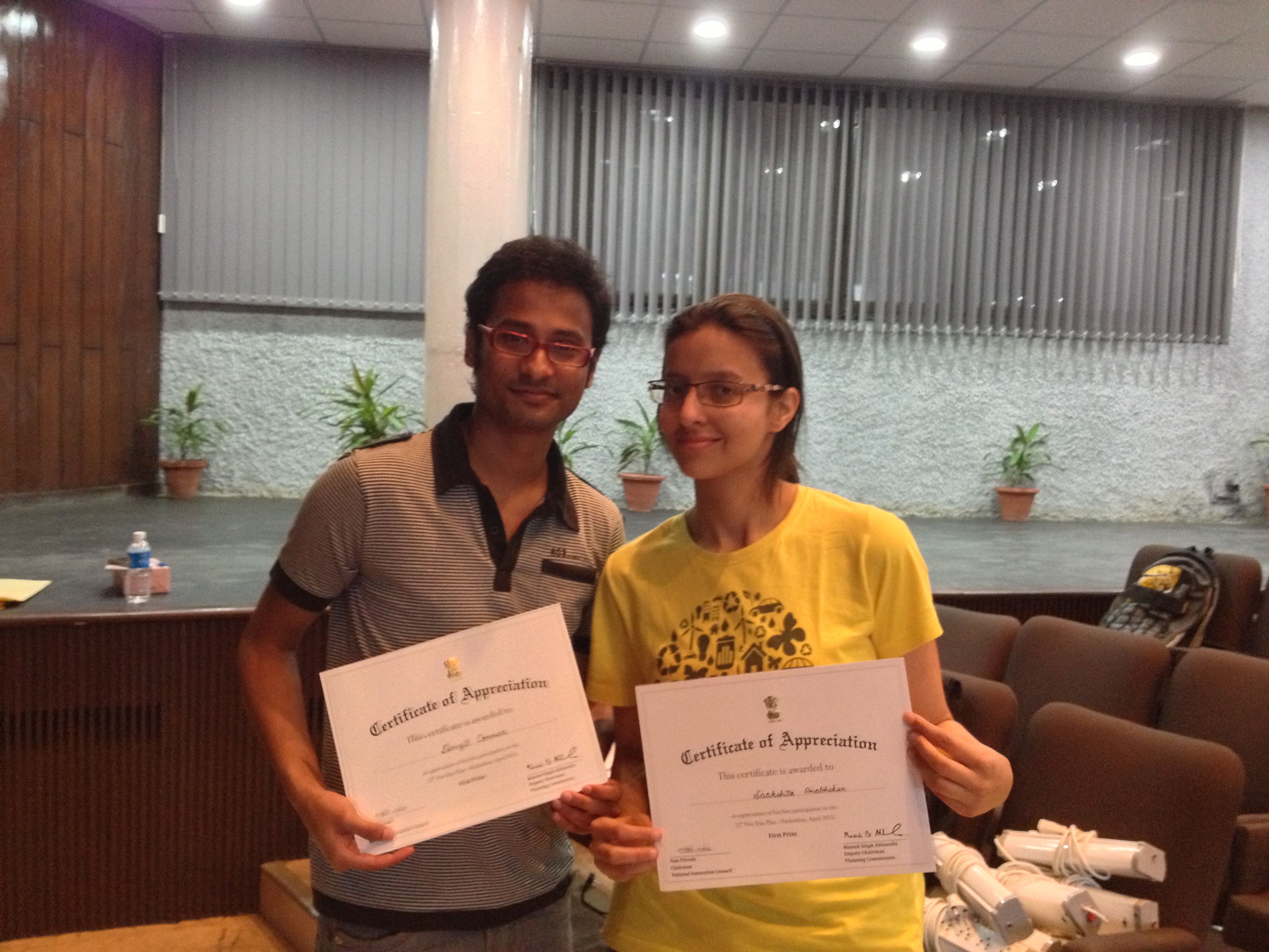
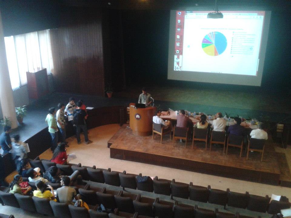
Photograph credits: Denzil Correa and Giriraj Singh Katoch
New Year New Beginnings
It’s been a LOOOOONG time away from blogging. When I opened my blog today, I realized that my last post was in December. No post for the year of possibilities (2013). So, to begin with let me take this opportunity to wish all the readers a HAPPY NEW YEAR.
Well, even though I haven’t been blogging, life has been pretty hectic in one way or the other. What is keeping me on my feet? It’s a bit of everything. Post Alberto’s course; I have been busy wondering about further studies (hoping to see things work out), adapting one of my works for a London based publication (a post on this later) thinking of project ideas (i have many) and trying to work towards the skills I would need to fulfill those ideas (vicious circle you see). Lastly, I have a full time job, which is getting more hectic day by day (not much to say there). What’s great is that, after 3-4 months of doing everything else besides data driven projects, I genuinely feel the urge to do a data-centric project. It’s as if the rest of the life post December has been a break from the my lovely data world and now I feel refreshed enough to do a data heavy project again.
On that note, lets discuss this opportunity here:

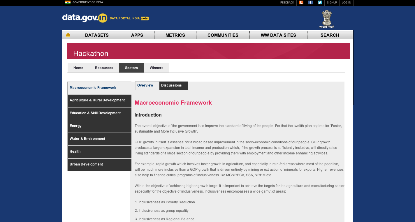
A friend of mine (Denny George) introduced me to this. Id like to take a moment to talk about the opportunity I can see booming here in India. In a way its exciting to see the government finally seeing some value in visual representation of data. While I am happy, I am skeptical of the quality that will be expected, submitted or rewarded post this hackathon. Nonetheless its a great opportunity to see the impact of dataviz in the mainstream industry and I think we should cut them some slack, when it comes to quality. It will get better over time (maybe decades even) with more sensitivity towards the concept of datavizualisation. You can see the hackathon here http://data.gov.in/hackathon
I am thinking of attending this hackathon and if I do, it shall be accompanied by the second post of 2013 (fingers crossed)
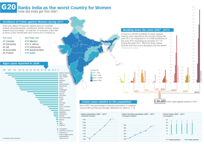
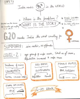
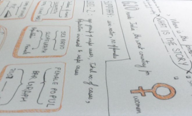
Week 6 – Indian women in a fix
The title of this post says it all. The course might be officially over, but there is so much to grasp and apply, that only practice can embed the learning now. As I wrote in my previous post, my initial struggle in finding a suitable topic really got to me. When nothing came to mind, I sought for inspiration from my surrounding. One day I sat infront of the television listening to the news, when I came across yet another case of a girl whose father was shot for warning the lecherous man who eve-teased his daughter. Then it dawned over me (just like the cliché light bulb over my head) that this could be the topic to visualize. All I had to do now was to pray that I find data specific to this project.
When I started thinking about the topic, I realized that there was a need for a bigger picture and finer details. As seen in my sketch below, there were some aspects of the topics I could consider (thankfully I found decent amount of data for it too). These aspects are listed as following:
- G20 country ranking
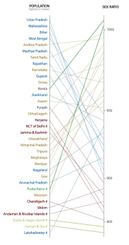
- Overall Population of the country
- Female population
- Crimes that are taken into consideration
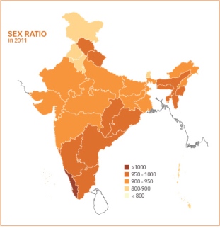
- Sex Ratio of States
- Incidence of crime across the country
- Rape cases reported (since that’s always in the news)
- Age-wise distribution of the cases
Of all these little stories, I couldn’t use all of them and therefore the selection process began. Some of the decisions were my conscious choice, while others were as a result of the layout of the infographic. Either ways I realized, that since one of the limitations (or maybe not) of a print graphic is its one glance view and not step-by-step journey (as incase of an interactive piece), I cannot afford to put all the details in this one piece.
Anyways one thing led to another and the final piece looked like this:
 For a clearer, zoomable view please see the link here
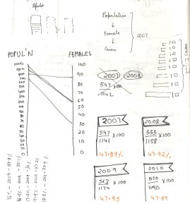
Please Note: I couldn’t find data for number of rape cases state-wise reported in 2011. If you can provide me with that data, Il update the infograph ASAP.
The story is basically to throw some light on the topic and show that while the male-female population is growing in sync with each passing year, the cases of crime against women has jumped to quite an extent. I am not sure yet of the reason and cause behind this (politicians and the culprits have their own versions), but the data surely opens our eyes to the status of crime in this country. Doing this project surely made the facts clearer to me. Being a girl in this country, I think it was a good topic to explore, gives more context to the news I hear everyday.
There are some graphs I didn’t manage to accommodate in the final infograph.
With just 4 days in hand, I did the best I could. I went through a great process and I know that for me the process was a bigger achievement than the final result. Having said that, I know myself that this particular infograph can be improved a lot (especially the colours). The course has motivated me to do many topics in the future and probably after I have slept a little, I will relook at this, like my other exercises on MOOC and improve on it.
Notes
Source
Links
http://feministsindia.com/india-ranked-worst-g20-country-for-women/
http://www.tradingeconomics.com/india/population-female-percent-of-total-wb-data.html
http://india60.com/stats/census/2011/
Reports
http://ncrb.nic.in/CD-CII2011/cii-2011/Chapter%205.pdf
http://www.trust.org/documents/womens-rights/resources/G20Poll2012-methodologyandresults.pdf
http://nipccd.nic.in/reports/ehndbk10.pdf
http://cbhidghs.nic.in/writereaddata/linkimages/6%20Demographic%20indicators9490761835.pdf
I guess I will write a separate post about my experience with MOOC but for now I can say that it was a great experience.
Week 5 with no high five
To be honest, this 2 week project has broken my exhaustive flow. Once I got down to sleeping, I slept like crazy and managed to finish the quota of sleep I lost in the past month. By the time, I got down to thinking about the assignment it was thursday.
So, the assignment for week 5 and 6 is bound to be our final project and when I read “This time, I am giving you the freedom to do whatever you want.” on the brief by Alberto Cairo, I thought to myself oh no!. The things is that when I am given choices I cannot get my head to focus on one topic. One thing was clear though I wanted to do a visualisation specific to India. Some of the broad areas of interest were as follow:
- Carbon or GHG emissions in Indian states over the years
- Sanitation provisions and concerns across Indian states
- Water borne diseases in states (hoping to get a story about the cause and conclusion)
Here is the thing. The week finished and I came to a conclusion that our country needs to document our data better. Its a pity that we dnt have a place form where we can take the data and play with it. There are so many reports and so little cohesive raw data 😦 I am saying this in the utmost agitated and frustrated tone possible. I am not suggesting that there is no data out there, but most of the times you have to write to departments or people concerned to get the raw form of data (xls files). I know this from my prior experience with my thesis project. Having said that I will take the opportunity on this post to tell you the places I dug out where you could possibly find some data about India:
- http://www.data.gov.in (New attempt from the government to store data)
- http://india.gov.in/documents.php
- http://www.indiawaterportal.org
The issue with the forums above is that there is no continuos documentation for a particular topic over the span of few years. Most of the topics are a documented over scattered years and it is difficult to gather any story without the criteria of continuous time. Secondly very few topics are distributed state-wise. If I want to study about a topic and its impact on India, I need some level of depth to get any story out of the data. general figures don’t say much. There is one source though that seemed promising
This looked like it had some potential with xls files, but the catch is that I need a membership, will find some time to figure out the deal behind its membership (aaaargh why can’t things be free, it’s the age of open source for god sake).
Anyway, having lost a week and no time to wait for data I decided to go ahead and just finish the assignment with any data I find and then I thought of Facebook. I thought it would be nice to see the growth of facebook and other demographics related to ‘fb’ in Indian states. Might be interesting to have a parallel angle of the number of people educated in these states during that time or the number of people who have access to computers. While I found general country facebook demographics, I couldn’t find any data I could use to tell a story. For general demographics on social media, I found this to be a good source:
The thing is that I wasnt satisfied visualising general facebook demographics. The voice in my head kept on saying ‘Now what, so what’ and my motivation was really low to even start the assignment. This is when I thought today, ok one last time lets give this data hunting a shot. Maybe I won’t get the topics I want, but maybe I can use the most cliche and boring data for India and visualise it with a twist. So, there are some sources that I think might work for my final project and I will share that with you in the next post. My 2 week project is going to reduce to a 3 day project 😦 Must stop blogging and run.
In case any of you have a portal or place in mind where we can dig out xls files of data, please do comment on this post and let me know. I will be grateful 🙂
Week 4 – so much more
No introduction for this one. It was just OMG. From the get go of the assignment, I made up my mind that I will finish this one ontime but here I am writing on a Sunday. This is going to be a long post, so I am going to cut through the chase and get started with the assignment
Brief
The Guardian’s Data Blog published a story about unemployment in the US here. Our goal was to get the data and create an think about what kind of interactive graphic we could create with them.
When I was sketching for this assignment, I could totally imagine Hans Rosling giving a presentation on Gapminder about this subject 🙂 You know with the bubbles of 50 states moving between the 2 axes. It has chronology, its has percentage of unemployment, it has population and with more (maybe not) aspects, there could be a perfect gapminder presentation. Since, I know people are familiar with gapminder, I decided to sketch this route in the end (never got to it actually).
In the first and the second route mentioned below, I have visualised only 25 states (for time limitation ofcourse) to explain my idea. Let’s begin
First Route
This one is something on the lines of a slope graph. Having said that I dont think it’s exactly like one because of all the slopegraph examples I’ve seen there are variables on the left and right which give the slope some context. If that’s not the case then it’s just a line chart.
For an interactive graphic I imagined something like the following: 


It has a timeline on the top to see the lines change in different years (gif animation at bottom left). It also points out the US average of that year on the right. There is also a sort button which when clicked would arrange the graphics like this:

To get a better idea of how one state progressed we can click on the state and it would show like this:


When I reached this state, I remembered something from the course; that was to give feedback for any user action. Which is when I thought that on rollover on the state names a view like this could show up:

What’s working in this module in my opinion is the overall message. Over the years, you can see where most of the unemployment percentage is changing. A small gif here

It also works at a summary level and detail level. What I am a little concerned about it that I don’t know how complex it would be to do this for 50 states and the fact that you cannot see monthly progress of the states (which is not mandatory but still!!)
One thing I noticed in this kind of graph is that the variables on the left are not changing it’s position, very unlike the slopegraph example I saw in the post here where the slopes have more context. When I saw this in the examples given by Alberto, I thought changing the positions of 50 states might be disturbing for the eye, so I decided against it (which is why I think it’s not a traditional slope graph)
Second Route
This route visualizes the information using histograms. It’s pretty straight forward actually. At first there is a US chloropeth map which gives us the situation of unemployment in different states as of September 2012.
Below you can see the histogram of US mapped from 2009 to 2012 and an empty square to compare a state you choose by clicking. The state you choose shows percentage of unemployment mapped monthly from 2009 to 2012. Also tells us the % difference from Jan 2009 to Sep 2012.


The other thing one can do is to choose compare and see the performance all the states (in this case I only did 25) on the same scale. Then the user can also interact with monthly bar of the state to get some additional information.


One can go back to the map view as and when they wish. The first view gives the states context and summary of the whole situation and the second level gives deeper details.
Third Route
This is more like a thought rather than a finished route. When I was thinking about the data, I saw some concern about situation becoming worse since Obama became the president. I am not a US citizen and don’t know much of the situation, but have a faint idea. I started wondering if adding an angle of population to this might change something or make some aspects clearer. I don’t know how true this is, but it is my speculation. Need some facts and figures to prove it maybe.
For example if we compare the states of Arizona and Mississippi. the percentage of people unemployed in Arizona is 8.2% which is 245,200 people and that for Mississippi is 9.2% which amounts to 122,700 people. So, as we can see that even though Mississippi has more percentage of people unemployed the actual value is much lesser than that off Arizona; and this is probably because Arizona has a bigger population that Mississipi (my conclusion) correct me if I am wrong though. So, in this option I explored a scatter plot between percentage on Y-axis and population on X-axis for 50 states.


I also decided to to a ‘Pre-Obama’ 4 years and ‘Post-Obama’ 4 years because I figured, incase the job opportunities in a state were fixed and the population increased over the few years (plus recession) then maybe Obama presidential rule didn’t do so badly in such a state, as in it didn’t improve but didn’t deteriorate either. Anyhow, must find a better way to communicate this but for now each bubble in this map, on mouse hover could also give some more information about the state in that year


Ok so that was it for this assignment. I know I am not expressing it well, but I am still loving this course 🙂 I know il miss it once its over. Now back to my life and its tensing agendas.
Peace
Week 3 – half way
Week 3 ends tonight and can I tell you this week got serious. Quiet forums, only one reading and no quiz might give us all a feeling that this week was easy breezy, but the truth (for me atleast) is that there was mayhem backstage. We had monster of an assignment and rest assured, it made me think and exercise my mind to crazy limits.
This week we were given a task to conceptualise the design for an interactive graphic based on this. The link was accompanied with this report. 5 days to skim through the report, understand and ponder over and sketch our assignment finally began to daunt me a little. Let me take this opportunity to say that the varying levels in the current representation of graphic done by guardian datablog doesn’t really work (but they have some great work too). Since the levels of ‘country’ and ‘organisaiton’ don’t have a common baseline you cannot tell their actual values.
Being a designer I often chose or have been lucky to work on topics that are interesting and not very data heavy (with the exception of Hollywood challenge in IIB). This assignment challenged the notion of doing convenient visualisations. The reality of dealing with relevant topics and enormous data can be attributed to this week’s assignment. One more thing I learnt was to strategically skim through BIG! reports to get relevant information from it. Now, back to the assignment:
From past weeks and this week I would like to list down a few points that resonate with me, everytime I approach any graphic now.
- What does the user want to know?
- What shape should the design take? Apt?
- Balance between form and function.
- If it’s an interactive graphic, does it have a summary layer, an option to filter details and details on demand.
With these points in mind, I began to target the problem. On skimming through the report, I came across a section that spoke about the different levels (namely activity, organisation and country) at which the different indicators work. I read few pages around this section and understood the story behind the data better. To sum it up quickly for you: there are 72 donors and with a new system the donors have 43 indicators at three level (activity, country and organization). Depending on whether the indicator was scored in those levels by our donors, their performance was measured.

Design Elements
SUMMARY LAYER | On top, a level that gives the summary of the story. The story on a broad level is ‘How transparent are the donors?’. There is an option to toggle between 2011-2012 to see how the percentage of transparency changed since last year. Point to be noted is that while the end result is still in percentage, the method to measure this result has changed since 2011.
RANKING | On clicking this button, it arranges the bars in decreasing order to make the ranks of these donors visible.

DONOR | It drops down a list of continents for the users to select from. Users might be interested in knowing the performance of donors in their country or continent. 72 is a big amount to present in a list and it would be inconvenient to choose from 72 choices, so it makes sense to do a little homework and group them into continents.
BOTTOM SECTION | Clicking any of the bars would initiate the second level of information. At the bottom, each donor is explained in more detail. The break up of the donor’s performance in the three level is seen here. You can also see the current rank and the ‘step up’ or ‘step down’ of the donors’ ranking since last year.
There was a general feeling in the classroom and I also agree that some users might feel the need to know the amount of money spent at these levels. So, presuming that we can find that data, I accommodated that in the left bottom part of graph.
Other Pointers
There are 72 donors for this list, the number is overwhelming and according to my learning from Lecture 2 by William Cleaveland and Robert McGill I decided to make the data set adopt visual shape of bar graphs. They are most intuitive and understandable for variables of this count.
The feedback for the rollover action on the bars at the bottom can give information like ‘the number of indicators scored at each level’.
One question I had was if I should give an option to compare another donor with the one you’ve selected? I am still not fully convinced about it, therefore you can’t see it on the sketch. Too many donors to choose from and why compare only 2? I am still thinking about this one.
While I thought about this assignment for one week, some of you might wonder is this the best way? The truth of the matter is that firstly, this is a course for conceptualising and processing rather than the form. Secondly,(I’m learning it now) it is important to let go the ‘moh’ (greed) of decorating graphics before perfecting its communication (this is not easy)
I don’t know if my submission shows it , but a good amount of brain wrecking went behind this shape. I am in no way saying that its the only option or the best option, but don’t judge the story by the looks of the graphic.
Process


Week 2 with Alberto Cairo
Hello to all of you!
It’s the end of week two at Alberto’s online course and I am loving the idea of taking this online course. Even though I have a full-time job and 100 other things to do and it’s getting harder to follow the course, I find some time to do justice to it. I recommend for people interested in data viz to take this course in Jan. Alberto literally lays out the fundamentals of info graphics and dat visualization through this course. Being a designer, I can say that the course emphasizes more than umpteen number of times on the purpose and need for information design. I’m finding it hard to stay away from the habit of pretty(fying) and beautifying graphics for the sake of its form. A chance to learn the basics I never knew of is a privilege.
Week two’s discussion topic was this:

To begin with when I saw this, I thought well this is pretty cool! It conveys almost everything it wants to. Words used the most, Obama using words vs Romney using the same; I dnt see anything wrong with it :O plus The New York times generally do a great deal with their info graphics, so must be perfect. At this point I wish I could tell my professor ‘Alberto, this is a good one, it will flex my brain muscles’.
Then when i knew ‘I was hired by Steve Duenes, infographics director at the Times, to make a constructive critique of that piece’ (hypothetical situation obviously), my mind started to see things it wouldn’t otherwise (ofcourse the readings and lectures during the course help a great deal). So, lets begin with what I came up with:
Things that work:
I like the interesting take on word cloud and the fact that the % of usage of words makes it favour either towards ‘republicans’ or ‘democrats’ (didn’t see this in the beginning though). The second thing I like is the choice of words, Words used are words that make sense in context of politics and debates. If you looked at it overall, you would get a sense of words used by either conventions. Many other positive points and on the whole I feel, the NYT did a good job in making bubble charts clear enough compared to some others out there.
Things that don’t work:
1. The bubbles are clickable but don’t do anything on click. Their function isn’t very clear.
2. When you drag the bubbles out of their place they go where you leave them. WHY?
3. There is a search bar on top to search for words, I didn’t use it much and am wondering if it’s really needed. It’s not a playful graphic and searching for words like ‘is’, ‘and’,’I’ is redundant and has no context
4. Some of the words like ‘AUTO’ and ‘WOMEN’ are described below and I cannot figure out why. Why only these words and not others? Why do they disappear when you drag a bubble out of its place? Initially they almost looked like sections for the graphic.
5. The pull out quotes at the bottom could be a nice element, but is easily missed in the scrolling. Plus its too long and doesn’t add to the story user is getting from the graphic.
The more I look at it and think of it; I realise that it’s a great graphic as a static and the interactive elements don’t have any value addition to the communication. They do things that seem to be deprived of any function. Most of the story that can be communicated is given to the user in the first go.
Improvements
What I can do to improve this communication follows:
I am not very good at coding and the lack of practice in Flash and Indesign hindered my attempt at making this interactive. Im still on it though:
So, the sketches follow:
This is how I see the whole thing readjusting itself ( it’s a concept sketch and can be worked on a lot in terms of appearance). What I liked about the previous one was the fact that the words would move towards one convention depending on which convention used it more. I feel the key message for users in this is the correlation of the word between the two conventions. A scatter plot in my opinion communicates 2 things clearly: Firstly, it tells how many times one word is used by both conventions. Secondly, it gives us an idea of which convention the word is leaning towards. The closer the circles (all same sizes) are to the 45 degree line the more balanced is the use of the word by both conventions.

What could also be a nice element is a zoom button to zoom into the congested areas and blow up the scale :O
Next step is when a user clicks on lets say OBAMA. This would make the bubbles settle in a state like this one:

Here all the words drop on the X-axis and show the way the words are used by the democrats. When one hovers on one of the bubbles it would lead to a screen like this one:

The word that the bubble belongs to shows up here with an added description or caption. One can go back to the full view and do the same steps for ROMNEY and republicans:


I know I don’t see much sense in the excerpts but maybe the interactive piece could look something on the lines of this: with much lesser redundant lines and better aesthetics.

